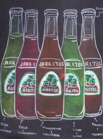
JARRITOSThe inspiration behind this art project is a combination between culture and Pop Art. Being my first project of the year, I decided to make a change in my style and have more connections with my art projects. As from last year my very first art project being Know Thyself, I didn't really had much context of who I really am but I have developed an idea of what does make me and whom I have become. Being that said I believe my culture has really influenced me into who I personally am. Just as it has become part of me I got the idea to make it part of my art work. By using Pop Art the idea extended to using a very popular product in my culture and making it stand out. Like many Pop Art art works they tend to play around with colors and used solid backgrounds to make the object or product stand out.
PALETON |
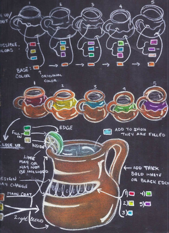
Not specifically being inspired by an art piece at first, I did more research into the color schemes used by Pop Art artist such as Andy Warhol and James Rosenquist. I as well used their use of colors to contribute my cultures own traditional colors. The color scheme expanded from solid primary colors to secondary colors. As this idea was developing I came between the option of having the actual product “Jarritos” or the actual traditional dish ware “los jarritos”. I took in consideration both and experimented with the colors as mentioned before. It came to the point were both can be made to stand out however I chose the one to be more familiar to me which was the actual bottled product. Being that chosen I took the flavors more liked by my family and us and that step being taken I decided to set them as well to the size of my family which consists of five family members. This made the piece have more personal connection and reenforce my culture with making who I am.
The way this project is going to be projected is unclear yet. I have the idea to either make it an acrylic on canvas or make into a photoshop piece. If it becomes an acrylic on canvas piece which I feel more strongly about as it will be more of a challenge, it would be one big bottle of my favorite flavor on a solid color background. That way it won’t only show my culture but part of me and the focus will be brought to this product. The strokes will have to very smooth and have very clean edges. As well the paint applied must be solid with possibly a white outline to create more of a pop art effect.
Consideration/ Idea expansion: In the future create a series of these. Such as all five bottles. |
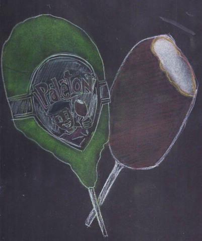
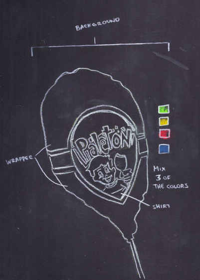
This project is being targeted to gain and improve skills in the process it takes to create a block print. However I decided to make it more challenging than my previous block print during Junior by taking the face of the kid in the treat and keeping its very detailed aspects. Keeping as well the colors in the previous art project planning; I plan to make multiple block prints and make a more of a Pop art traditional style. By that I mean having the style of Andy Warhol and her art piece “32 Campbell's Soup Cans”. The colors scheme will consist of bold colors and have colors that will make a strong contrast with each other. As a form of repetition and bold colors the art movement of Pop art should be well captured and the message of Mexican culture should be quite transferable.
|
Following the previous project and the enjoyment of the experience I had with it; I decided to use the same inspiration and theme of culture into my second project. But with a different media from the previous one. For this project, I looked into this sweet because it is something I grew up with and it has a personal connection as it was a must buy for us when we went grocery shopping and to this day that tradition has not quite change as it has not as well passed on to my nephew with a similar brand. Paleton is just a product that stand out in my life and as a level of personal connection it is pretty strong. with a similar brand. Paleton is just a product that stand out in my life and as a level of personal connection it is pretty strong.
|
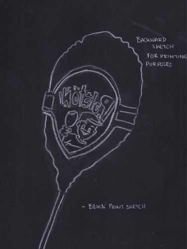
Something that was learned and applied this year was the fact that print will come the opposite way it was carved. So the way it was applied in this project was making a sketch of the image backwards to applied and carve that way in the block print so when its printed the image will come looking the correct way. Another skill that will be applied is by making sure the details are well carved enough and that the edges are a clean as possible to the outline of it looks well define and with the use of colors it will stand out. On the sketch anything that is black will be carved away and anything outline white will be how the print will result. This helps me through the process in knowing how to manage it and it won't become a mistake that will take the time that would be use to make clean prints.
Untitled
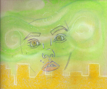
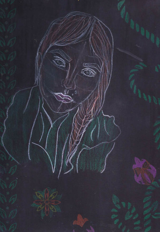
This project’s idea originated from the different key concepts that lead me to take this project the direction it did. The first purpose of this was to expand the media in my portfolio and gain new experience. Before knowing what I was exactly going to do, I knew it had to be a photographic piece contributing human form. The idea of this project as well came from a project that was done by me for the class, Theory of Knowledge(TOK). The topic of the project was the perception of beauty. I really wanted to emphasize how beauty can be found in anything and what better way but to use art to demonstrate anything can be beautiful even in the world of art. The way human form and beauty was used together was to make ones features more enjoyable and stand out from the “ordinary”.
Keeping the same use of vibrant and stand out colors I been using all semester I choose very earth based colors such as Blue, White and Green. Following with more inspiration towards this piece I looked as well into an art movement that I have had very low use of and experience with. Inspired by the art movement of Post- Impressionism and more specifically by the art piece “Starry Night” by Vincent Van Gogh. I took movement done in art works of such style and took the flow of the movements used to bring life into the piece. With the lines and swirls used in “Starry Night” which brought attention and movement to the sky; I used it to bring attention and life to facial features such as the eyes. The idea is to use very flow free strokes and light on those areas.
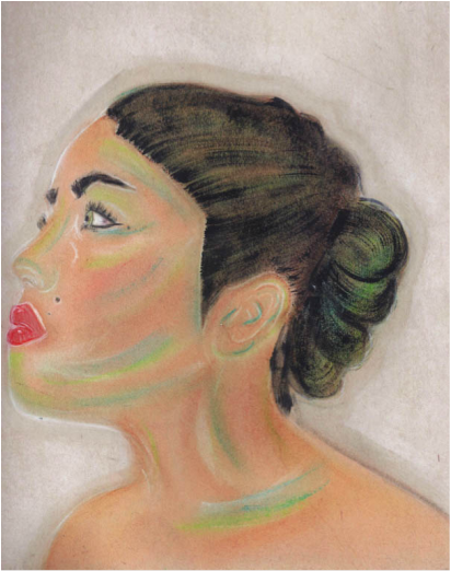
The way this project is planned to be targeted is by using facial paint with the previous colors mentioned and created movement around the eyes, nose, and mouth. However the paint will only be placed to an extent so it wont cover the canvas in this case being a humans face and still show natural beauty.
- Trial: The face paint was not as vibrant and pleasing as expected. So acrylic will be its replacement.
- Acrylic paint functioned much more effectively
Untitled
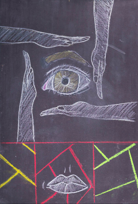
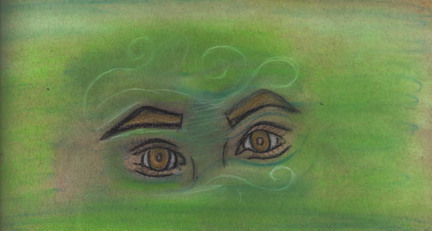
The way this art piece is going to be aimed at is by taking different shapes and vibrant colors that can be nicely matched and place them close by facial features. The color scheme varies between color such as blue and orange or possible red and yellow. The fact there is many ideas leading into this project might end up as a series or more than one image.
The method being looked into, to target this project is using tape or some sort of straight edge tool to get a clean edge. The colors would be place around the eye to bring more attention towards them. As well using different directions of lines will create more motion going on. The canvas will still be noticeable and much more cleaner than the previous art piece. Another idea of using more than the face is as well being considered. Photoshop would be used to enhance some the colors vibrance and adjust contrast levels. |
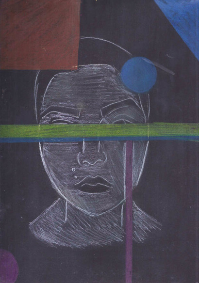
Expanding my photography skills, I decided to create another photographic piece. Using the same techniques on solid color background and acrylic on human form. The plan is to change the style and movement of this piece. Instead of using free flowing brush strokes, it is planned to have straight edge colors that do the same purpose and emphasizes all facial aspects. The inspiration of this piece comes from the art movement of Neoplasticism. Being a whole new art movement, will bring challenges and research towards it. Neoplasticism was never an art movement that instrested me and had very low value to me. However with a whole new experience and being able to see the art work at the Art Institute of Chicago in person brought a whole new interest in Neoplasticism. Personally I know how hard it is to achieve a full solid color background and the skill it must have taken for artist such as Piet Mondrian to achieve that. I began to appreciate the workmanship taken into the art and learn how putting effort into such art work can create such a meaningful connection to the piece.
|
|
This piece has become a challenge as it is not easy to get straight edges and solid colors that no strokes are visible. I as well have limited time as the acrylic paint tends to crack if applied in large amounts and the process must be done quickly. The more I experiment with the shapes and colors the more I enjoy neoplasticism and gain more experience as trials are done over and over.
|
Untitled
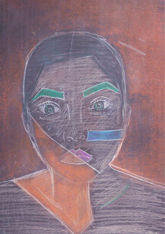
Being my last art project and having so much enjoyment from the last photography piece of myself I decided to make a self portrait but with a culture that I have no connection to but just the fact that I'm fascinated by the fashion, style and just the culture in general. I decided to do an exploration of cultures and keep an open minded of how other cultures can have so much beauty and meaning if it introduced and explored. The inspiration to this piece comes from the Hindu culture. I searched their way of dressing and style. Along with that I searched the techniques used into Henna which is a popular trend from their culture going around. The aim of this project is to put my self into this culture and make the background with a henna style pattern.
The challenges that are being predicted is having to do such detail work with acrylic. Even though the canvas is being planned to be wood so wood burning is being taken in consideration as it would be a new challenge and experience.
Process: Wood burning resulted harder than expected and a lot of practice to achieve clean results must be taken first. The idea has been discarded for this project but practice will be continued.
Acrylic became too much of a mess for such details so they next trial is to use a color pen or fine marker just for cleaner edges.
For the pattern behind my face it must be done as a stencil for more accuracy and clean results. The pattern must have a flow and constant color scheme so it won't take away from the self portrait. It would become more of challenge do to working with a canvas of such different shape. I am used to working with 90 degree canvas but this one is circular and even the material is different.
Trials: Different stencils were attempted. It was done by paper and cut by a thing blade. The stencil was outlined and for the other more detailed patterns it was done on paper and retraced over and over as it was too detailed to be cut out.
The look of this self portrait is to keep it as realistic looking as possible. I will apply skills from before with flesh tones and create blended shadows.
As this work is being processed I have found it easier to blend colors on such material (wood). The more that is added the more it comes together. I have attempted to keep it as clean as possible and used red to bring out the face.
Not only will it bring out the face but it makes the background stand out as well. I belive that makes the culture be more emphasized and the syle be more realistic.
Shadows and Highlights:
Shadows and highlight are begin added into the cloth making it look as the creases are more realistic. It as well helps it have a soft tradition between the cloth and the hair.
- Stencil idea is being processed. It is planned to have multiple shapes in itself and very detailed figures in itself.
